Caracol
Usability Testing Plan
Background
Caracol’s discovery phase began in early 2024, identifying a need for connecting homeowners and renters with home decor professionals. This test evaluates key functionalities with new users.
Goals
Identify issues first-time users face with Caracol’s core features and evaluate their impact.
Test Objectives
Assess the login process.
Determine search functionality effectiveness and ability to book professionals.
Evaluate usability of creating and managing projects.
Methology
I conducted a moderated in-person usability study, beause it allows for direct observation and immediate feedback of user interaction on both mobile and desktop devices. During the study, a significant challenge was managing user frustration with the search function not being more visual. I observed that users struggled with the search bar and the home page, leading to confusion and delays in task completion. To address these issues, I collected detailed feedback and used it to improve the search functionality and home page layout. These insights were critical in enhancing the design and overall user experience.
Participants and Schedule
Six participants fitting Caracol’s target profiles (designers and architects) were tested on April 24 and 26, 2024, in Miami from 10:00 a.m. to 3:00 p.m. The participants comprised 3 males and 3 females aged 20-40, professionals with interest in design. They were selected to represent a variety of backgrounds and expertise within the design and architecture industries, ensuring a diverse range of insights.
Script
For the detailed Test Script and task list, explore: Link
Usability Test Report
This report summarizes findings from the usability test. The focus was on interactions such as logging in, searching for professionals, creating project, and booking appointments.
Issues and Recommendations
Issue 1: Unclear service offerings before login (Medium)
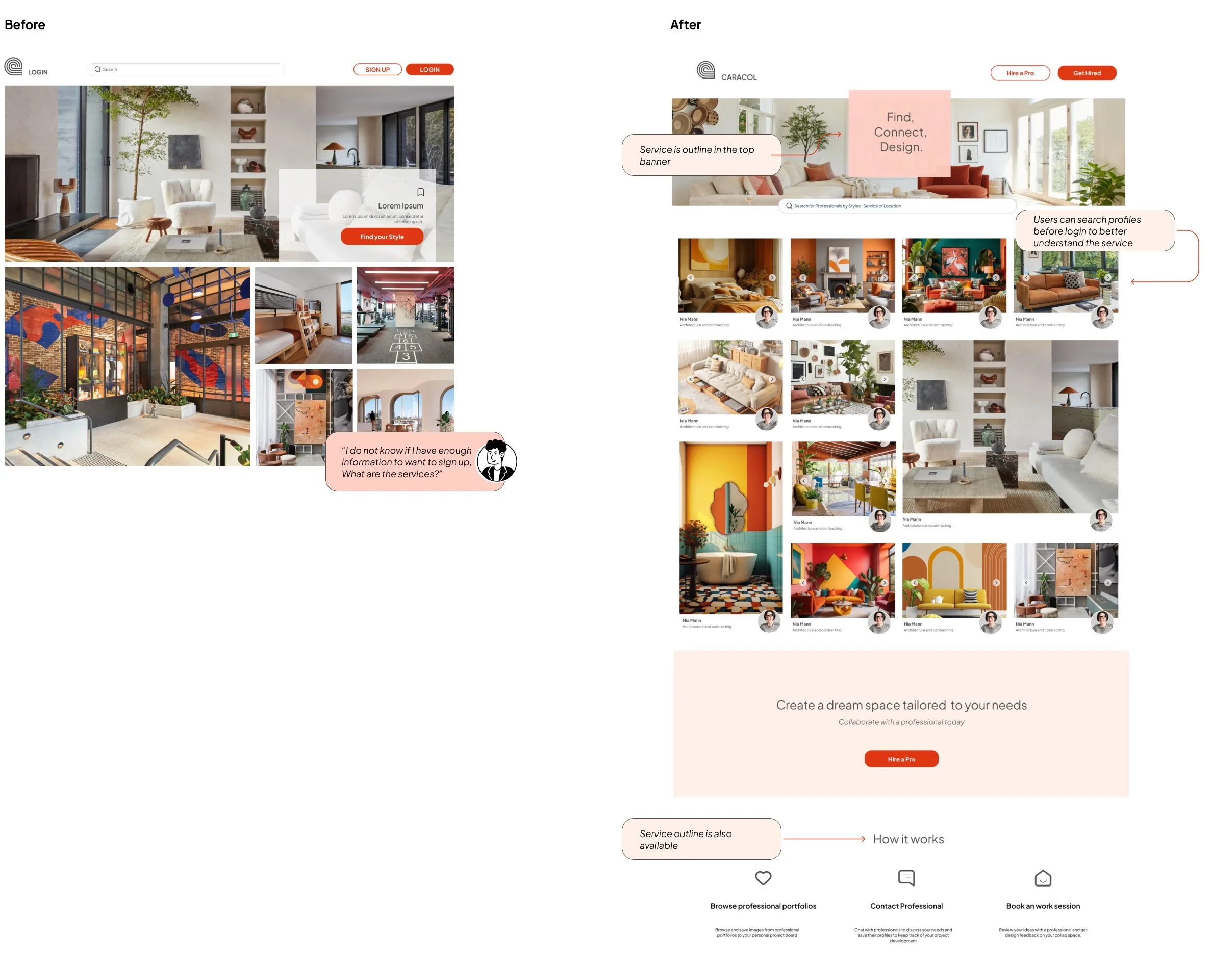
Evidence: All participants showed signs of uncertainty about what the platform offered before logging in.
Change: Outline services before users log in, incorporating elements that allow preliminary interaction.
Issue 2: Confusion over account type selections during login (Medium)
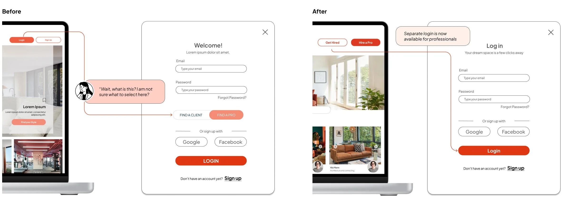
Evidence: Users hesitated during login, unsure of which account type to select.
Change: Create a different login pathway for professionals, separate from standard users.
Issue 3: Confusion over search bar functionality (High)
Evidence: Participants were confused about using the search bar as they were unsure of specific keywords.
Change: Images have a footer with profile information to clarify you can search profiles from the main page, search bar remains as an alternative option. Users can toggle between sections easily, and recommendations based on searches.

Issue 4: Unclear service descriptions during booking (Medium)
Evidence: All participants expressed confusion about the scope of the call they were booking.
Change: Add more detailed descriptions of services on the booking page.
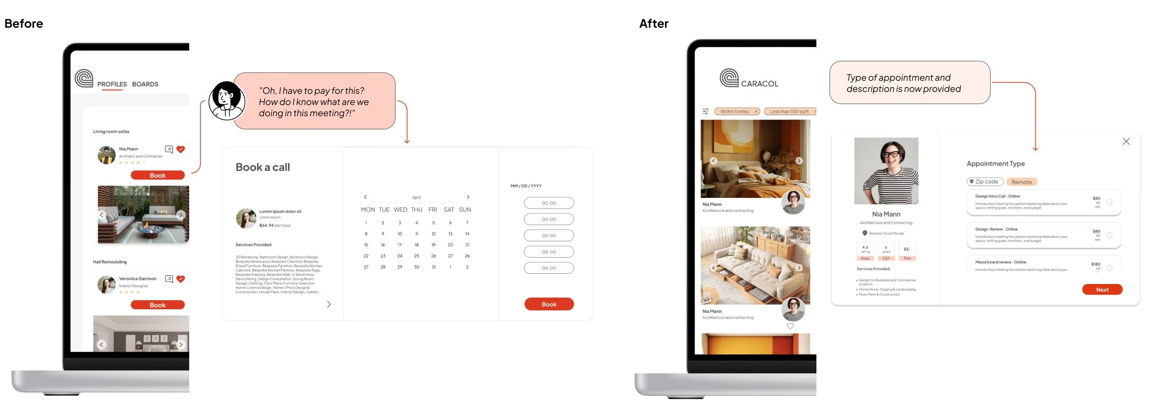
Issue 5: Missing location and price filters (Low)
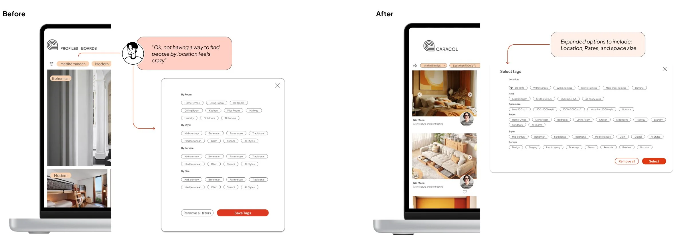
Evidence: Participants sought filters like location, rates and project size but found them absent.
Change: Add filters and place them at the top of the filter list.
Preference Test
Description
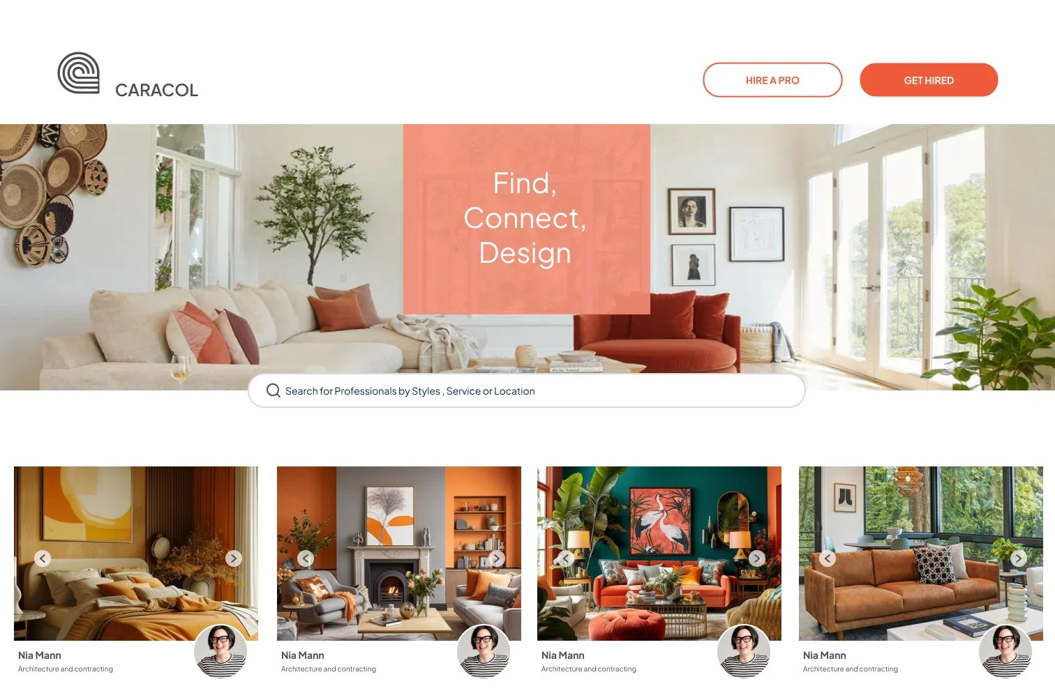
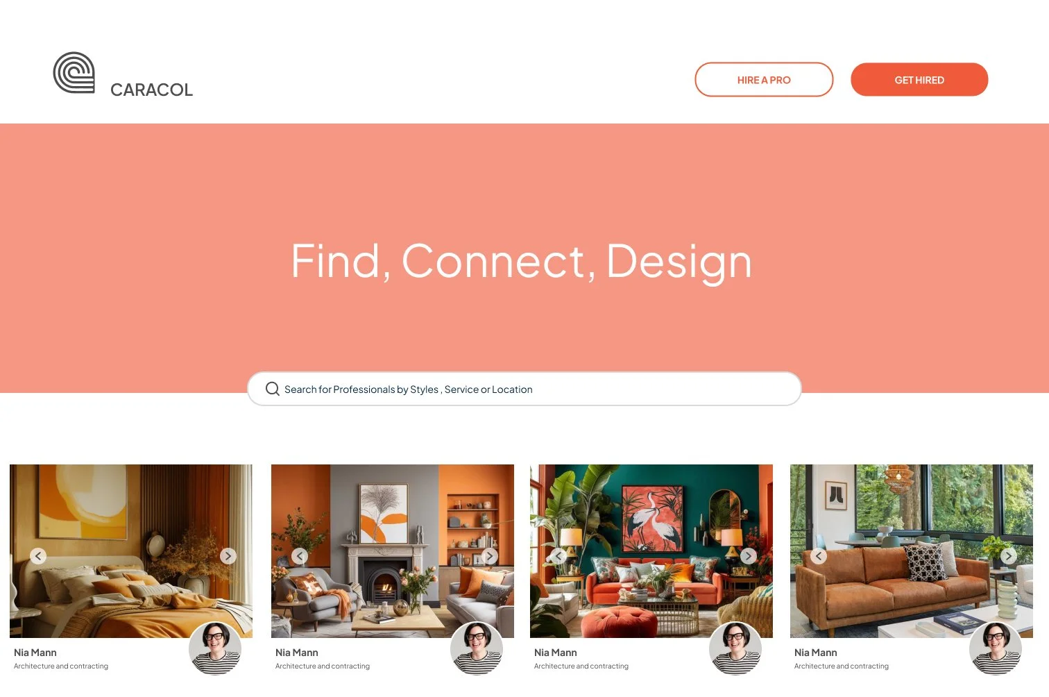
The test evaluated home screen banner design with two variations: one with a background image and one with a color background. It aimed to gather insights on the background type's impact on visual appeal, readability, and overall aesthetic preference as the banner highlighted the search bar. 9 out of 10 testers preferred the image background version, one out nine preferred the search bar out of the banner all together.
Final thoughts

Moving forward, understanding user preferences between different versions of the Caracol app is crucial. Users are primarily trying to achieve efficient and effective engagement with design professionals through the app. Our usability study revealed that aligning the app with these goals is essential to ensure adoption. Additionally, users showed a preference for visual searches, which enhance their ability to find relevant professionals quickly and intuitively. Evaluating the ease of use and overall experience helps us understand how well the usability aspects meet these preferences. These insights will inform the design decisions, ensuring we create a version of the Caracol app that meets functional needs and provides a enjoyable user experience, ultimately enhancing user satisfaction and usability.