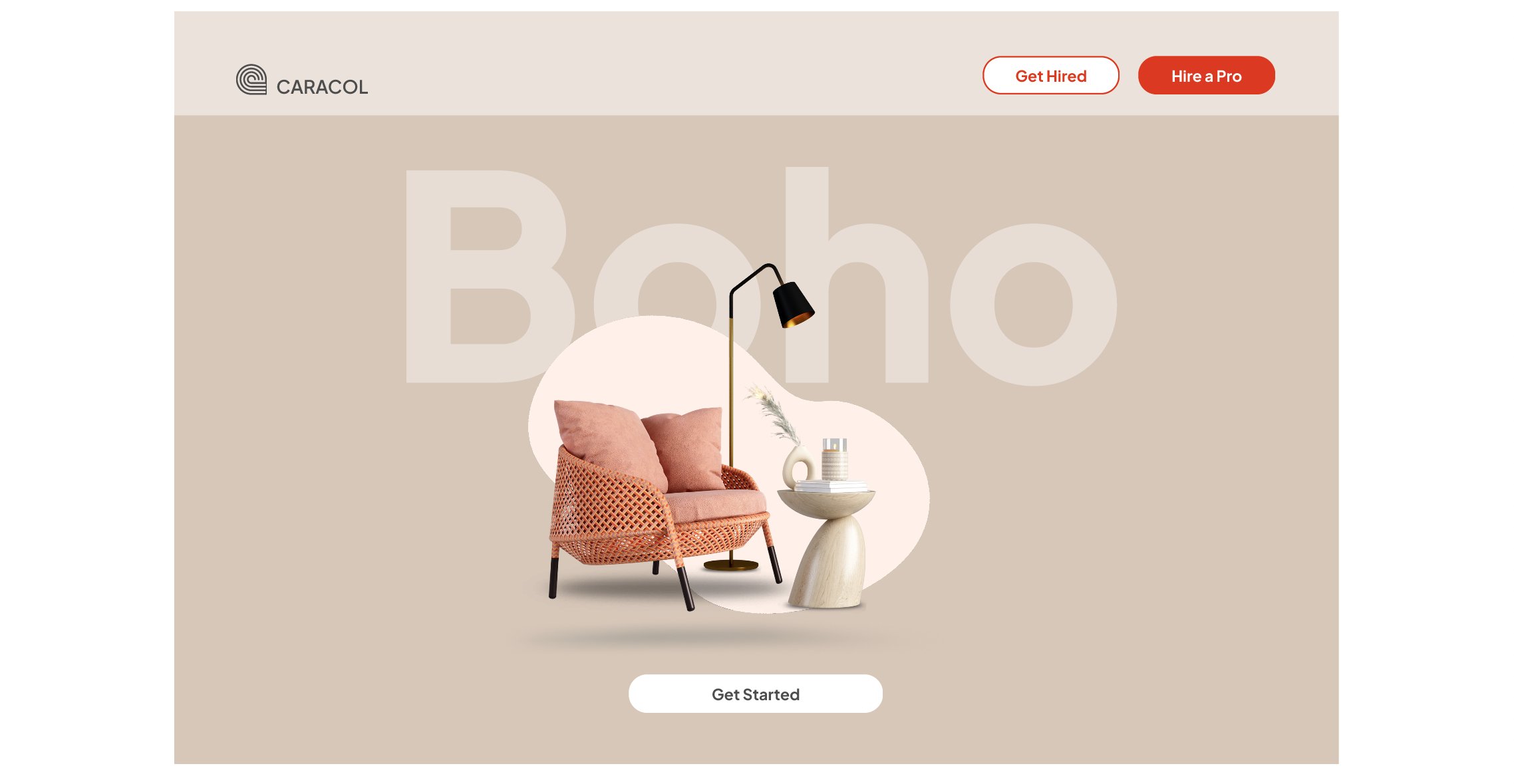
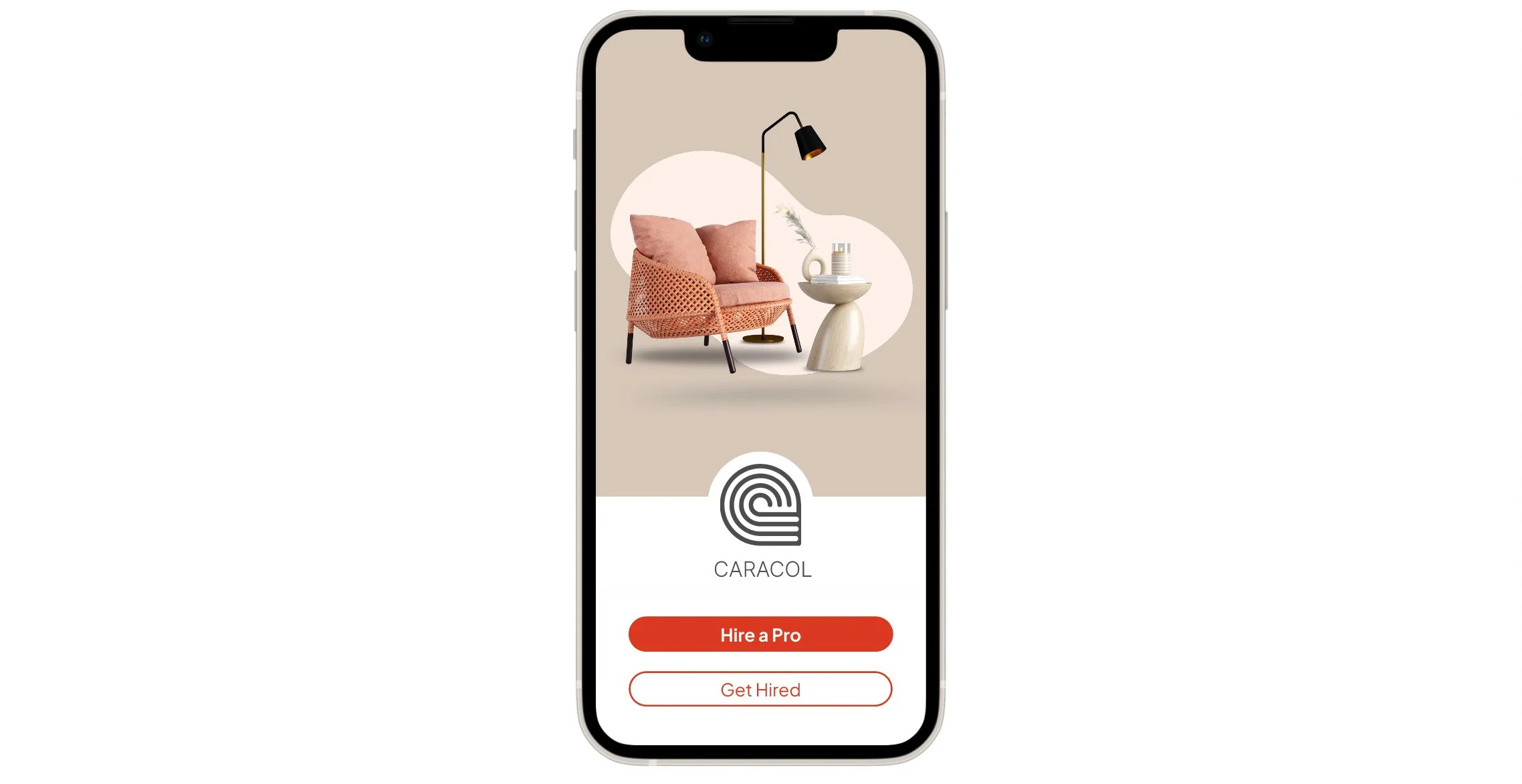
Caracol
Connecting people with home improvement professionals

Stakeholders

Career Foundry
Product Design Certificate
Project Role

UX/UI Designer and Project Lead
Tools Used

Figma
Adobe Illustrator
Photoshop
Midjourney
Key contributions

Competitor Analysis
User Personas
Flows
Wireframing and Prototyping
Usability Testing
Branding & Emotional Design
The challege
Create a web and mobile application that helps people connect with home improvement professionals.
Seemingly Simple, Surprisingly Complex
The Process
My process leveraged user goals and business goals to define the strategic direction of the product. I focused on generative research methods like user interviews and card sorting to create user personas, task analysis and flows. This research informed the development of the information architecture, wireframes and prototypes. Finally I conducted an usability study to further improve the design and prepare for developer hand-off.
Project Goals
The goal was to create an app that made it easy for users to search for and connect with professionals. The app needed to support browsing, booking, payment, and direct communication functionalities.
The Results
Accessibility
+15 %
usage
Login
30%
faster
Navigation
25%
more efficient
Define
Learning from our users

Insight # 1
Finding the right professional
Users struggle to find professional services relevant to their needs, mainly due to uncertainty in terminology or becase they do not know what to look for, leading to potential mismatches.
Idea: The app should enable users to search using visual cues, such as cards that display professionals' portfolio images, simplifying the discovery process.
Insight # 2
Choosing who to contact
Often, users need additional time to ensure they've chosen the right professional before booking a call, so they prefer to save profiles to review again later.
Idea: The app could allows users to save professional profiles to designated projects, helping them to compare and consider different professionals at their convenience.
Insight # 3
Tracking appointments
Users reported that keeping track of appointments during a project can be challenging, often resulting in missed meetings or disorganized project timelines.
Idea: The app should allow users to review both upcoming and previously booked appointments, to help users keep track of past calls and prepare for future ones.
The interviews helped me understand the challenges users face when searching for home decor services and identify opportunities to improve connections. With this insight, I created user personas like Trini, who embodies the needs of users like Hamlet and Daniel in finding professionals through visual cues and tracking projects effectively.
-
![Personal resume or profile of Trini Azan, a marine biologist, including a photo, personal details, interests, goals, frustrations, personality traits, motivations, and app usage description, with sections highlighted in shades of blue and purple.]()
User Persona
-
![A step-by-step guide titled 'Trini Searches for a Professional' outlining a process for booking a professional via an app, including steps like landing page, login, search profiles, view profile details, interaction options, and decide action, with bullet points for booking a call and saving contact.]()
Task Analysis
-
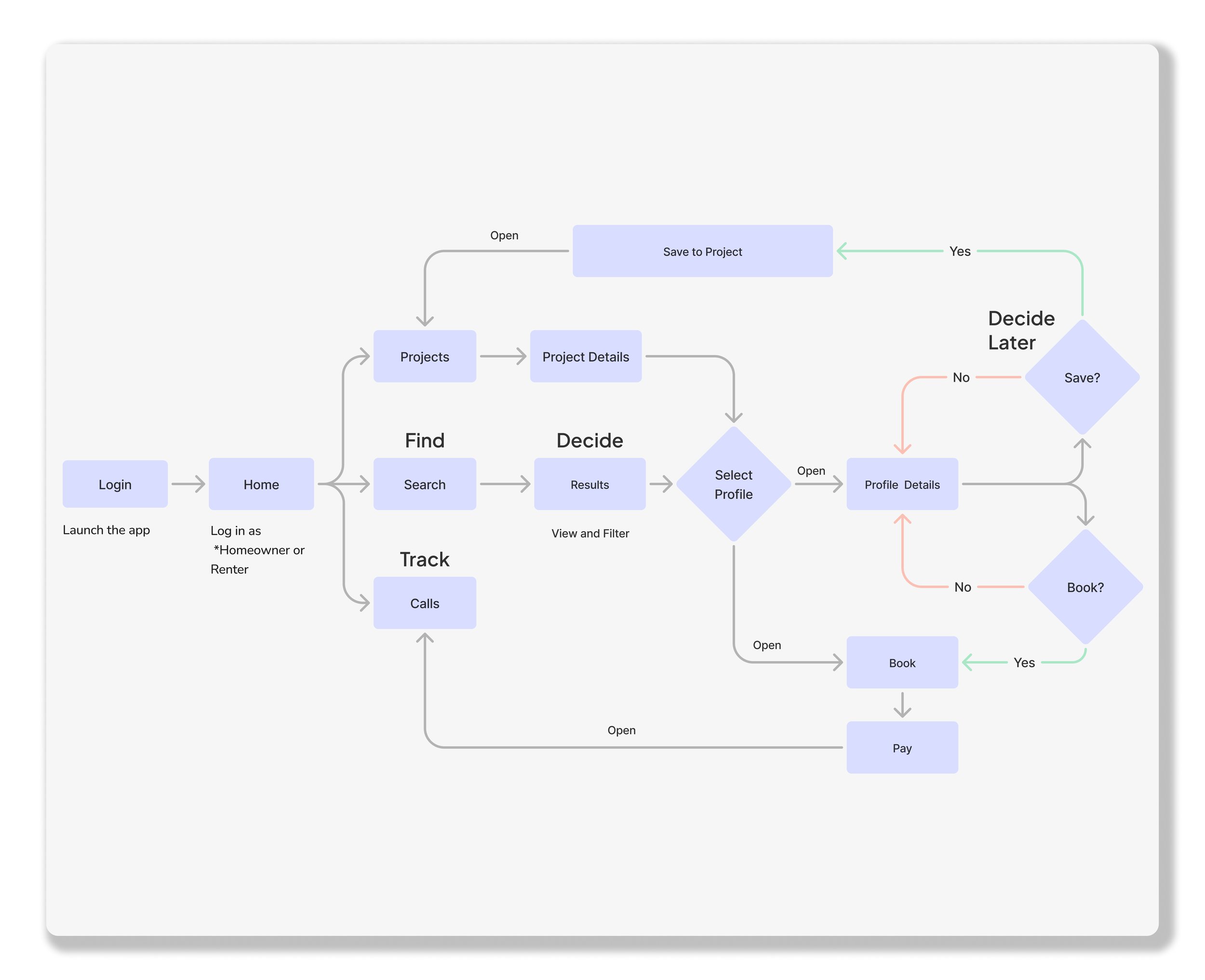
![Flowchart of a project management app process, including login, home, search, find, track, project details, profile selection, saving, booking, and payment steps.]()
User Flow
-
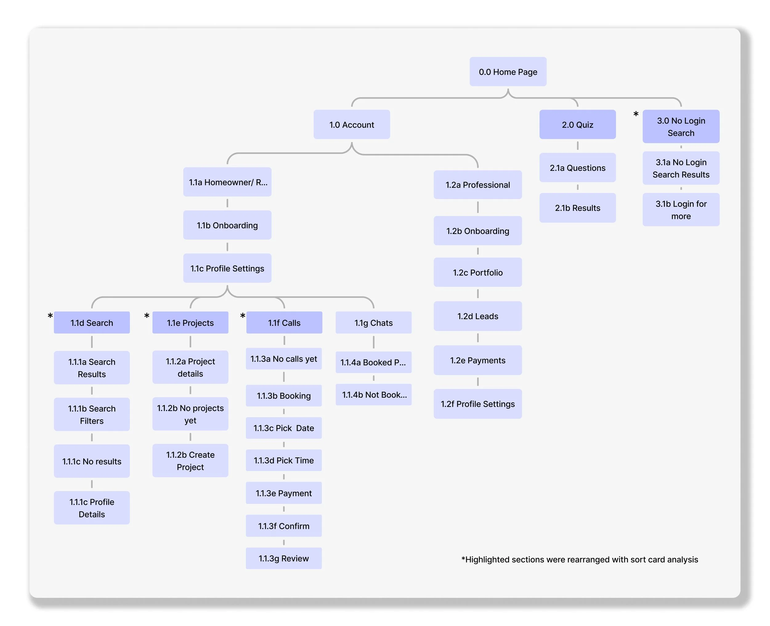
![A detailed website sitemap diagram depicting the structure of an account management system with sections for home page, quiz, search, professional and homeowner onboarding, project management, and payment processes, organized in a hierarchical manner.]()
Information Architecture


Develop
From Ideas to Pixels
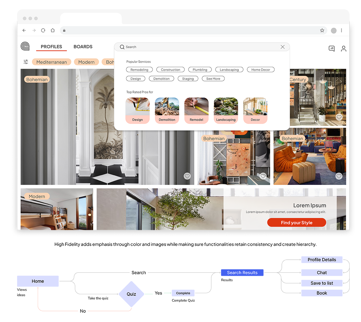
In developing Caracol, I adopted a Mobile First Strategy to prioritize the most important information and actions. I focused primarily on reducing cognitive load for the search functions and maintaining consistency across prototypes by using familiar visual elements and patterns. In higher fidelity prototypes, I focused on visibility to enhance the user interaction.

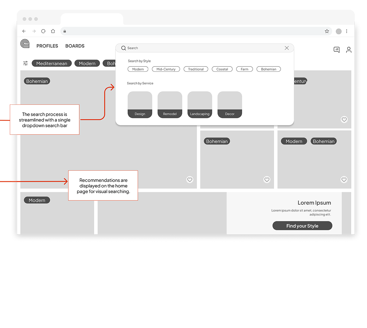
When scaling up from mobile to desktop, I modified the Search functionality from a full-screen approach to a drop-down search bar, maintaining the structure of text input and visual cues from the mobile version. My hypothesis was that this design could meet the needs of users like Trini, and its effectiveness could be verified during subsequent testing.
Deliver
So, does it work?
I conducted a moderated usability study to evaluate login, search, and booking functionalities on mobile and desktop devices. The study revealed users were often confused with navigation, and mistook the profile recommendations for inspirational content. Based on this feedback I set out to improve the design.
Issue #1
Unclear service offerings before login (Medium)
Before

All participants showed signs of uncertainty about what the platform offered before logging in.
After

Change: Outline services before users log in, incorporating elements that allow preliminary interaction.
Confusion over account type during login (Medium)
Issue #2
Before
After

Users hesitated during login, unsure of which account type to select.
Change: Create a different login pathway for professionals, separate from standard users.
Issue #3
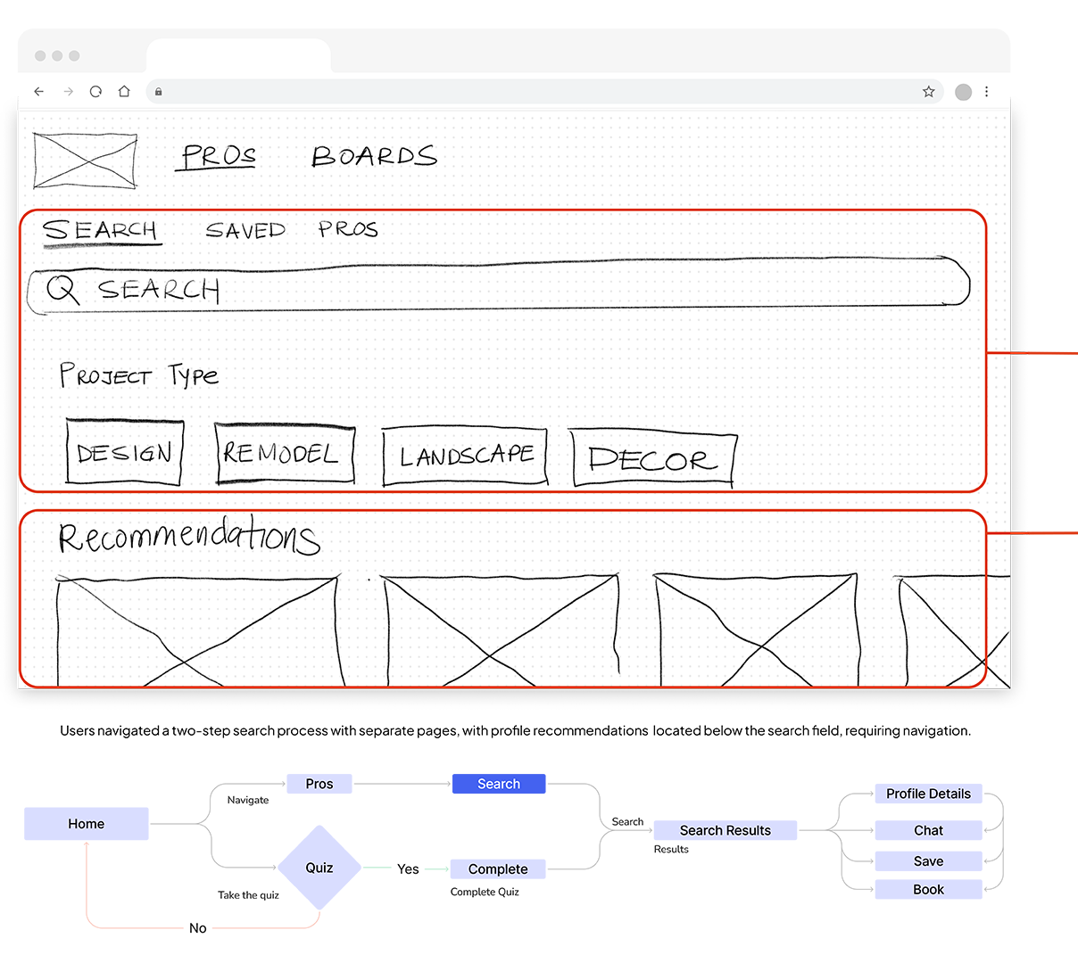
Profile recommendations are mistaken for for inspirational content (High)

Before
After
Participants were confused about using the search bar as they were unsure of specific keywords.
Change: Images have a footer with profile information to clarify you can search profiles from the main page, search bar remains as an alternative option. Users can toggle between sections easily, and recommendations based on searches.
Issue #4
Accessibility compliance (High)

Before
After

Some colors under the 4.5:1 ratio for fonts under 19 pt making harder to see. CTAs were in uppercase which can impact readability for people with dyslexia. Smallest font was 10px and CTA text size is under 20pt.
Change: For all text, including UI components and graphics, maintain a contrast ratio of 4.5:1 or higher. Ensure text is readable and avoids excessive use of uppercase, which can be harder to read. Ensure text body is a min of 12 px and CTAs are 20 px. Make sure Text is align left.
Prototyping
Deliver in Style
After addressing the most pressing issues found during testing I animated the prototype so that it was a closer reflection of how our users would be interacting with the app.
Give Caracol a try!